Category Archives: You’re Doing It Wrong

Re/Max NJ: You’re not doing it wrong…but you could be doing it better

So on my way down the Garden State Parkway to the Jersey shore this past weekend, I pulled into the infamous Cheesequake rest area (my personal favorite) to get some gas and a drink for the remainder of the trip. In pulling in, I was greeted by a giant sign for Re/Max NJ. What a great idea – not only would those signs target prospective homebuyers but also possible new agents…AND people both traveling within and through NJ – kind of making them a customer and employee acquisition tool. The URL was prominently displayed at the bottom of the sign, remax-nj.com. So I pulled out my phone and went to the URL, half expecting a non-mobile site to come up. But to my surprise, a mobile formatted site showed up and loaded pretty quickly. OK we’re getting there! (note: I was the passenger on this trip, so wasn’t texting while driving :))

So here’s the part that I would have normally posted into my ‘You’re doing it wrong’ category, but hey they had a mobile site, so I can’t go too hard on them. Sure the form fields are pretty small on my iPhone 4, the interface elements could be a bit larger. Like 40% larger. I’m sure some creative director talked about everything being above ‘the fold’ instead of being clickable with anything but an infant’s thumb or an electrostatic-enabled pencil eraser.  Call me progressive but personally I prefer usability over keeping design and UI elements within the ‘fold’ as the fold is different on devices and changes based on rotation. Plus thumb-scrolling is pretty widely accepted in getting to the bottom of a page (and its quick too). And, if coded reasonably well a text-entry dialog will have a ‘search’ button clickable after entering text.  But hey at least its mobile-friendly which is more I can say about most sites I visit.

Moving right along, so from the search page I check a few boxes then click SEARCH. My mouse pointer returns to the ‘Enter City, Zip, Address or MLS#’ form field. I figure maybe I missed the miniature button, so I carefully take aim and click again. Same thing. So here I am at a NJ rest stop, I haven’t a clue what city I am in (apparently Cheesequake isn’t a city as it returned an error), no idea about the present zip code, and based on the lack of knowledge regarding the previous two options it’s safe to assume that knowing an address is out of the question. I won’t even comment on MLS#. All I want is a listing of properties nearby that match the checkboxes I’ve selected (Single-Family, Condo/Townhouse, Multi-Family) and I can’t execute a search.

To make matters a tad worse, my second thought above was what a great recruitment tool this would be. Sadly there wasn’t even a mention of ‘Join our Team!’ or anything similarly upbeat and aimed at recruiting new Re/Max talent. Anyone reading this that runs a business knows the cost of finding talent; with the awareness and sheer eyeballs seeing this sign, I see that as another lost opportunity.

Anyway the title of this here entry includes ‘…you could be doing it better’ so here goes. First, let me search. Sure it taxes your database just a tad more to allow me to do a search without any text in the search box, but give me some results. Even if the empty box search returns some featured properties (maybe with some tools to refine my search), do something to put some property information on the screen for me. I got to the site, you have my attention for 15-30 seconds. Something…anything. Red error message text generally results in me clicking the top right button and putting the phone back into my pocket, or switching back to Words with Friends.

This leads me into fix #2. The mobile device is good at a few things – making calls, sending texts…and knowing its location. So fix number 2 is…(drum roll)…PUT A GPS SEARCH ON IT! People from all over travel the Garden State Parkway, help them find properties. Each rest area may have different results, it could be fun. You could even make a contest out of it if you wanted. Regardless, put a (damn) GPS search on the page and show me properties near this place where I’m getting food, gas, and generally killing a few minutes before I hop back on the road. Or lets combine 1 and 2 here – if my search field is blank, prompt me for my GPS location. Kill two birds with one stone (or query in this case). You get my drift here.

Rant aside, it’s a shame because lack of a mobile strategy and planning is certainly turning business (and possibly talent) away from Re/Max NJ. They have great billboards with great visibility. The billboards are all new (I didn’t see them last trip) and they’re BIG. While reading this some folks will probably say ‘well yea but we want to drive people to our website.’ That’s great! But let me know if anyone has their PC rigged into their car so they can view the full site in the few minutes they have between highway hauls. Or instead rely on the memory retention of GSP drivers after having seen hundreds of miles of advertisements…I doubt many of them will get home, unpack, and remember to go to the URL they saw on the sign (what was that website again?).

The really bad news here for Re/Max NJ is they have someone like me seeing the sign, thumbing in the URL and getting to the site – and all they’re getting is a bounce. I’m sure those signs, and the space on which they’re built weren’t cheap. I’m the target demographic, and I may even be looking for a small summer home on the Jersey shore…with no way for me to find it they missed their opportunity. But alas, next year around his time I’ll be going back down to the shore, hopefully by then they’ll have read this article and either fixed their mobile site or brought on an actual mobile vendor to do it correctly – instead of a web vendor who builds a miniature website to say that they ‘do mobile’.

Or, maybe by then I’ll be driving to my summer home which I’ve found between now and then.

Borgata Poker…You’re Doing It WRONG!

This one broke my heart – in more than one way. So any of you who know me know Im a poker player. I have the attention span of an unmedicated 3 year old with ADHD after drinking four red bulls, yet i can spend countless hours at a poker table drinking bad beer and studying every nuance of the 9 overweight and bacterially unsound fellows at my table. I don’t know why actually, i just fell in love with the game when i was young, playing for pennies with my mother and grandfather. Living close to Atlantic City and Upper CT, i have poker player cards to virtually all AC casinos as well as Mohegan Sun and Foxwoods, and receive trees worth of mailings from them each year.

The other day i received a nice glossy piece from Borgata, advertising their 2,500 buy in no-limit hold ’em event. To my surprise, i saw a QR code on it! Now they’ve used texting for a while (as have Foxwoods and some others), but this was the first QR code i’ve seen – peep it!

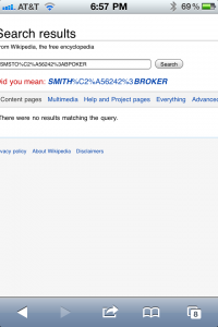
So, all giddy i grabbed my iPhone and scanned it. After scanning it i just laughed out loud…the Borgata, the epicenter of poker in NJ and one of the classiest and most luxorious casinos on the east coast – with one of the best websites and some of the greatest marketing around…WAS DOING IT WRONG. Here is the result of my scan:

Their QR code was supposed to set up an SMS, yet on the iPhone it was an epic fail…apparently their agency didn’t realize that iPhone doesn’t support that SMSTO syntax. I dont know if it wasn’t tested, or if their agency just doesn’t care, but on that day the Borgata dropped about 10 points in my mind. They’re now a notch below Trump Marina, and just edging out Resorts in terms of lameness.

This sort of thing is unacceptable. We just deployed a campaign for a major (MAJOR) brand, and they wanted a QR to resolve to an SMS. Unlike Borgata’s agency who either doesn’t care about or doesn’t understand mobile user experience, we created a routine that actually worked, instead of throwing some slop against the wall and likely charging far too much for it.

Im thinking they probably sent tens of thousands of this piece out to poker players. Some bean counter probably expected some result, but that bean counter is in for a surprise…not a single iPhone who scanned that can participate. They’re pretty much saying ‘hey you’re our customer, but if you have an iPhone screw you, you can’t use our QR codes.’

Its one thing to do it wrong accidentally, but this is a clear case of negligence, not thinking, not testing, and delivering crap to your client under the guise of pretending you know what you’re doing. A story written by my business partner John Lim called ‘can you trust your geek‘ hits on some of these issues. But the fact is people, your interactive agency is NOT your mobile agency. You can’t be a part-time professional anymore. Its like back in the 1990s when the www was forming. Your print company offered web services. Some companies stayed with them and got an inferior product. Others went with a dedicated interactive agency, and got a better product, more service, more technology and in almost all cases more results.

The old drug slogan, ‘just say no’ is applicable here. When your interactive agency or web design company offers you a mobile service, just say no. Then find a mobile agency (like Mobile Card Cast – shameless plug) who can listen to your objectives and put together a plan to achieve them and even surpass them. Let your print company do your flyers, your web company do your website, and your mobile company implement your mobile campaigns.

As for the Borgata…I still love you guys. Give me a call and let me help you do it right. A free seat in that 2,500 NLH tourney would get you back in my good graces, then we can go from there. But, next time you see the moron who put this together, walk up to him and bitch slap him in the face, and say (with an english accent) “Im mad as hell, and Im not going to take it anymore!!!!”.

Miller Mobile – You’re doing it wrong!

I couldn’t resist this one. SMS has been in play for years now, and yet still overpaid agencies can’t get it right. Please see exhibit A below:

Now, let’s take a look at this. This is obviously a coaster, likely being used in a bar or club to promote Miller’s “Win Epic Prizes” campaign. At a glance we can tell legal got their grubby hands on even the tagline…’epic’ has an asterisk which makes me question the epic-ness of the prizes. I digress.

It doesn’t take more than a middle school degree to realize that the goal of this campaign is to have customers text in – that would likely create a successful campaign. My prediction: the campaign to win epic prizes will be an epic fail.

First let’s look at the keyword, or what we at Mobile Card Cast call the Mobile ID. Not only is it a 10 character Mobile ID, but its mixed alpha-numeric. This will not only strongly deter folks from texting in, but exponentially increase both the possibility of input error and the frustration level of the user – most users will have to toggle between the alpha and numeric keyboard modes during input. Fail #1.

Second, let’s look at the shortcode. OH THAT’S RIGHT, I cant see it either. This is to be used in a bar people, and anyone who’s ever been to a bar can agree that for the most part they’re not the most well lit places on earth. And how about the call to action? The word ‘Text’ is equally illegible. So my question is, what brilliant Creative Director decided to use 8pt condensed font for the shortcode and CTA? Are they giving away free illuminated magnifying glasses to potential participants? Fail #2 and #3.

Rants aside here, you can see why this is categorized in the ‘You’re doing it wrong’ section’. The Mobile ID is cryptic; the shortcode and call to action are illegible in the environment within which they will be viewed. This is why having a strong mobile team on your side is important…it will prevent your ‘epic’ campaigns from becoming ‘epic’ fails.

But hey, at least it will keep the moisture off of the bar.

Fridays: You’re Doing It Wrong

This is my first post in what I hope will be a series of blogs categorized as “You’re Doing It Wrong”. Im going to attempt to find epic fails in the technology and mobile space. And trust me, there are PLENTY of them!

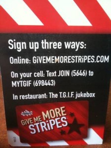
Lets start with Fridays “Mobile” play. I have mobile in quotes because its a pathetic attempt at a mobile campaign. Its a perfect example of how to ensure minimal results. See the image below:

Lets figure out why they’re doing it wrong. First off, whats with the numbers? Do i text JOIN or 5646? And, where to i text it? to MYTGIF, or to 698443? Or to MYTGIF (698443)? Does my phone allow me to put parenthesis into a text message? Do i text JOIN with the number in parenthesis? Now comes the part where the customer doesn’t text in, and the business loses an invaluable opportunity to acquire a customer.

The irony here, is that you’re supposed to text JOIN to 698443. Simple, right? But the messaging is so confusing, id bet there are 3 failed attempts for every 1 success…that is, assuming that anyone has ever texted in. My guess is that most customers look at it, dont immediately understand it, and push it to the end of the table.

Now, lets think motivation. Hmmm, just finished a steak – why am i texting? OH right, to join the Friday’s “Stripes” program. What the hell is that, and why would i text in to join? Is there a benefit to texting in? What am I getting? Is the text in free? No one knows. Copywriters and strategists get a D- on that one. Id give them an F but i kind of like the font.

This is a classic example of a decent creative or marketing firm assuring their client ‘ah yes we can do mobile’ and sloppily coming up with some half-assed concept and implementing it through one of their similarly half-assed partners. Its a completely wasted opportunity, a great example of what not to do in mobile, and should be a lesson to all of you out there. Fridays has a great opportunity here – their customer is sitting there for 45 minutes or more with nothing to do for the majority of the time. Fridays probably monetizes their rewards program, in addition to the loyalty they create. Make the program clear, offer a benefit, and maybe – just maybe – your customer will text in. Make the program confusing, offer little to no value, and lets face it…YOU’RE DOING IT WRONG!

But hey, lets look at the bright side from the firm’s perspective. They’ve succeeded in convincing their client that ‘mobile isnt right for their brand’ or some similarly pathetic excuse for their own incompetence. So at the year end review, they can tout that the website is working but mobile isn’t, and thus direct more of next year’s budget at web and less at mobile, in order to keep their client’s business. The fact is, however, that 2010 is the ‘year of mobile’ – and more and more brands are creating and expanding their mobile budgets, and will continue to do so for the next few years. Why? Simple. When done correctly, mobile can be a game-changer for any brand out there. When done incorrectly, its simply a small bar on a graph, a flat line on a chart, and an indication that a company is slowly falling behind on the technology side.

Wondering the right way to do it? Shoot me an email: TheOtherJohn@MobileCardCast.com

PS – are you from Fridays or the Marketing company behind this trash, and pissed off? Good, that means you read it, and you’re on your way to not totally sucking at mobile. Admit that you suck, and we can help you. Or, just go on sucking and the evolution of business will swiftly and efficiently make you extinct, which it does so well.